
How Long Does Bad Content Last?

Don’t let random (and mostly inaccurate) factoids dictate your content strategy.
by: J.S. Stansel
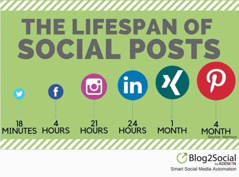
Recently I noticed an infographic detailing the lifespan of content as published on various platforms circulating in social media marketing circles. It was shared by several high profile social media experts and was taken at face value as fact by many. I had seen similar graphics many times before over the years and wondered if this was a new one with more recent information.
You can see the infographic as posted by its most recent source below.

As I looked more closely, I began to have strong doubts about the accuracy of this post. The source, Value4Brand, an online reputation management, digital marketing and SEO company based in New Dehli, India did not provide a link to the research behind these claims. So I decided to do some digging.
I reached out to Value4Brand on Twitter to see what their source was. They pointed me to a post from SproketWebsites who cited the IT company Mamsys as their source. Mamsys seems to only have shared the infographic as a retweet from a business consultant based in India--and down the rabbit hole I went.
Interestingly enough, it appeared that Value4Brand’s infographic was a slight re-editing of a post shared by Mamsys. It appeared that Value4Brand had updated the social channel logos slightly and added their brand logo to the bottom corner. (A sign of a completely reputable company that respects intellectual property, right?) So, my next step was to run the infographic through a Google reverse image search and see what came up.
What I found was a TON of similar images using all the same data. These posts dated as far back as 2016. However, I found myself going in circles trying to find the original source. Site X says the data came from Site Y. Site Y says the date came from Site Z. Site Z says the date came from Site X. And not a single one questions the validity of the information or provides information as to where the data was from.


It was buried on the second or third page of the Google search results, but I found it. A graphic with sources included!
It was published on July, 20 2016 and came from Maria Peagler the founder of SocialMediaOnlineClasses.com.

The studies she cites vary in the range of quality, methods, key data points, and sample size analyzed. Some of the studies are no longer available. They vary in dates posted with the oldest study dating back to 2012.
I’m going to stop there for a second and remind you just how long ago that was. 2012 was the year that Facebook bought Instagram, Obama was elected to a second term, the first Avengers movie was released, Gangnam style took the world by storm, it was the year Grumpy Cat was born. Not the year Grumpy Cat became a meme, the year the freak’n cat was born. That’s how long ago it was. In the world of social media, that was an eternity ago.
Are you still using the same social media marketing strategies you used back in 2012? I hope not, because I’m pretty sure Facebook has updated their algorithm a couple of times since then and Instagram as added just a few new features and maybe a few more users as well.
Just for the sake of argument, let’s say that the data in the infographic was 100% accurate at the time of its creation, even at 2016, I think it’s fair to say that things have changed a bit since then. So, maybe we shouldn’t be altering our strategies because someone tweeted out an infographic with information sounded good to spit out in a meeting?
Additionally, pulling the data on the lifespan of content of various networks from various studies all using different methods makes this graphic untrustworthy at best. Sure, maybe one or two of the studies were well done, but we can’t say the same for all of them. Yet, the graphic that is being wildly circulated doesn’t mention that and is being taken as universal truth. This is a dangerous way to inform your content strategy.
Suppose we could get accurate, up-to-date data on this topic. Would knowing the lifespan of a piece of content really be that valuable? Sure, there’s some value in it, but is it enough to really shape your strategy? Are you going to start posting to Twitter every 18 minutes to keep your content fresh? This is the kind of information that entices executives and clients to give their social media managers content quotas. “I saw an infographic that says Tweets only last 18 minutes! You need to be posting at least 4.4 times every hour!” Are you going to spend more time on one platform because you think the content is going to last longer? This is why we get #MondayMotivation posts that add nothing but noise to your social feeds.
Here’s a secret. Don’t let random factoids dictate your content strategy. Post content when you have content worth posting.
We all know that there’s a lot of misinformation online and as social media professionals, we should know better than to blindly accept random infographics as fact without a verifiable source. We should be the ones questioning the veracity of questionable social media posts, not spreading them.
Don’t get me wrong, I’m not calling the infographic “fake news.” It seems that at least one point, it was reasonably researched and presented in a transparent manner. But that was a long time ago. The problem is that it is still being shared as if it were current. There are a lot of so-called social media experts, calling themselves gurus, rock stars, and ninjas who claim that they have the secret to social media success and these sorts of infographics are the snake oil they sell. Don’t give them credibility and most of all, don’t be one of them.
When you come across a piece of content like this, here are a few questions to ask
1. How old is this information? Social media changes so quickly, even if this was accurate at some point, it’s probably no longer.
2. How was this data gathered? Did they use any sort of aggregator? Was it self-reported? Did they just count likes over time? These things matter.
3. What was the sample size? Was it large enough with a diverse array of content types and users to be relevant?
4. What metrics determine how long a piece of content lasts? Was it number of likes? Link clicks? Shares?
5. Where was this study done? Different cultures have different social media habits that could affect the outcome of the research.
Questions abound and you need to ask them before sharing a random infographic someone posted to promote their social media consulting/SEO business. This is especially true if you have a platform that people pay attention to. If you work in social media and have people who follow you for content related to social media marketing, you have a responsibility to be sure what you share is well-sourced. Even if you don’t work in social media, but are in a position of authority in your workplace, a VP or C-suite exec, you need to question these sorts of “fast facts” before you accept them as gospel and ask your team to rearrange their strategy around them. This goes both for what you see shared on social media and what you hear at conferences. Do your own research and decide for yourself. Even if the data is reliable, it might not be right for your organization’s situation.
I have a feeling I’ll have this graphic sent to me at some point by a self-proclaimed “expert” who thinks we should alter our strategy based upon this unreliable infographic they saw another “expert” share on Twitter—or more likely LinkedIn. So if anything, I guess this infographic proves that good content may have a long life, bad content sometimes can live even longer.